Have you ever viewed a website on your desktop computer, then switched to using your mobile phone, but the site looked different, and you can’t find what you were looking at?
How a website looks depends on whether you’re using a desktop, laptop, or mobile device, like a phone.
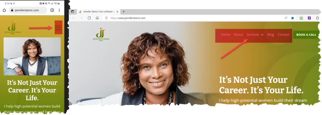
Take my company’s website, for example; if you click the web address www.jenniferstarns.com using a mobile phone, it looks like this:

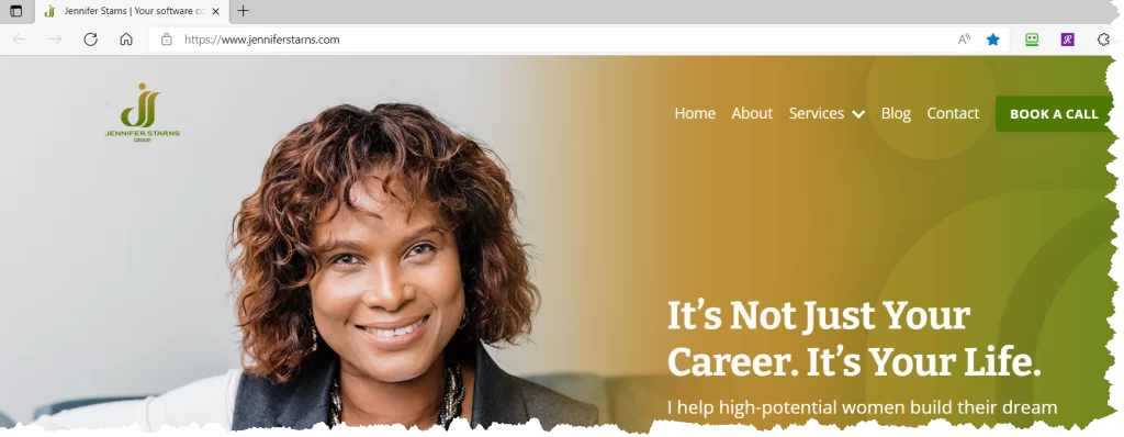
However, if you open the same address, www.jenniferstarns.com, while on a desktop or laptop, you’ll see this:

Do you notice the difference?
Mobile phones have a smaller area, so they’re designed differently to fit the same information. So, if you’re using a big computer screen, use the menu (buttons, tabs) shown as “Home,” “About,” “Service,” etc. to see everything.
However, if you’re using a mobile device to see everything, click the hamburger button.
Yes, “hamburger,” notice the two buns with patty:

Another difference in websites is that some sites no longer have “Home” to get you to the first or main page. To get to the main page, click on the company’s logo! Try it out using my website:
- Go to a new page, then click the Company logo (the image that says “Jennifer Starns Group”).
- Go to another page, then click on Home Page
- Notice that the Company Logo and Home take you to the same place.
With this post, I am illustrating a simple example of how software consultants work; we help people experience technology in a way that makes sense to them and improves their lives.
How would you like to do this, helping businesspeople? They need people like you who empathize with their challenges, identify their needs, and are motivated to meet them.
- Check out my website, www.jenniferstarns.com/services to learn how you could build a career and life you love, then
- Book a call with me!

